History, snapshots and reports
Live monitoring answers "how is the network now?". Snapshots and reports answer the rest: how it was before, what changed and how to show it to someone else.
Saving a snapshot
Save snapshot (Ctrl+H) stores the complete state of that moment: stations and APs with their metrics, the diagnosis verdict, the baselines you had set and each device's session state. It also stores your References table, with the names you gave them and how they were answering: their response time and their packet loss. The Snapshot appears in the Snapshot history, above the tables, with its date and time.
A Snapshot says how each Reference answered, not only whether it did
Each References target is stored with its latency and its loss, so a three-day-old Snapshot tells you how it was answering. Snapshots taken with a version older than 1.3 do not carry that data, and their cell shows a dimmed dash.
- A project keeps up to 20 Snapshots, and none is ever removed on its own. The history counter (
{n} of 20) tells you when it is full. From then on, to save another one you have to delete or export one. - Snapshots travel inside the
.sscopefile, so backing up the project also backs up the history.
It pays to save one while the network is healthy, for example after maintenance. Months later it will be the best comparison point you have.
Viewing a snapshot
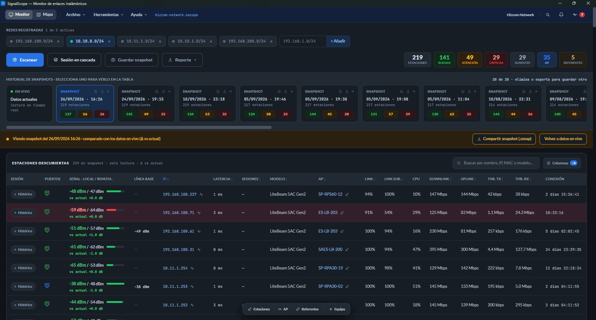
When you select a Snapshot in the history, the tables show that moment in read-only mode: each row's session says "Historical" and a banner says it is being compared with live data (Δ vs current). Under each station's signal you see how much it changed between the Snapshot and this instant, if the device has a session now. It is the fastest way to answer "was this link like this last week?". Back to live data leaves the view.
Comparing two moments
Tools → Compare snapshots is marked beta: it works, but which metrics it compares and how it presents them may change in future versions. It crosses two Snapshots, Base (A) and Compared (B), or one Snapshot against Live · now, and lists additions, removals and changes per device. When it opens it already proposes the most useful pair: the second-to-last against the last, or your only one against the live state. The magnifier filters by name, IP or MAC.
If you replaced a radio in between, the removal and the addition say so: "Replaced by …" and "Replaces …", with the other device's MAC.
Changes come out as chips, grouped by what causes them, which is what matters when reading them:
- Someone changed it: firmware, AP, frequency, channel width. These are configuration changes, not the air.
- The physical link changed: the signal moved 5 dB or more, for example because it rained or the wind moved the dish.
- The network was being used differently: link quality, modulation in both directions, air time, capacity. They describe each Snapshot's instant and are the noisiest, so they start off and you turn them on one by one in the Metrics menu.
It also flags Ethernet port changes (cable unplugged or reconnected, duplex and speed changes, cable errors) and sessions that dropped or recovered from one Snapshot to the other.
A protected Snapshot can be compared. The exception is one with its MACs trimmed: without the MAC there is no way to pair the devices, and the tool asks you to pick another one.
When the two Snapshots come from different eras
In v1.2.0 how link quality, capacity, consumption and distance are measured changed. Comparing a Snapshot from before v1.2.0 with a later one produced differences no device ever had: the subtraction was correct and the result meant nothing.
Now those columns (Link down, Link up, Downlink and Uplink) stop being compared between Snapshots from different eras. A note at the top says which ones and why, and in the Metrics menu those entries appear disabled with the reason "Not comparable between these two captures". Everything else (signal, model, firmware, AP, port, configuration) is still compared as usual.
And modulation on airOS 6 and RouterOS
Those firmwares publish no modulation index, so the column shows the rate in Mbps, and that rate jumps between steps from one reading to the next. The Snapshot stores it and the table shows it, but comparing two instantaneous readings would say nothing about the link. On those devices the comparison has no modulation to show.
Why doesn't it compare traffic or uptime?
Traffic is the customer's consumption at that instant: downloading in one Snapshot and idle in the other says nothing about the link. Reboots and reassociations happen every day on a WISP (customers who turn their antenna off at night, power cuts), and flagging them would fill every row with notices and hide what does matter. Link capacity is compared, because it is health and not consumption.
PDF, Excel and CSV reports
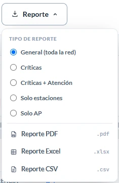
The Report button exports what is on screen: the live state or, if you are viewing a Snapshot, that Snapshot with its date in the header. The three formats come from the same data and say exactly the same thing. PDF is for handing over, Excel for working with, and CSV is meant to open with a double click in a Spanish-locale Excel, with no import wizard. There are five report types:
| Type | What it includes |
|---|---|
| General (whole network) | Stations, APs and References. |
| Critical | Only stations in critical state. |
| Critical + Warning | The technician's work list. |
| Stations only | Every station, without the AP table. |
| APs only | Access points alone. |
What they carry inside
Up to three tables:
- Stations and Access points, with each device's CPU usage and free RAM. A device the app shows as saturated reads the same in the PDF you send the customer.
- References, with the same six columns as its table (Monitoring · Latency · Name · IP / domain · MAC · Vendor) and with every target, monitored or not. You added every row in References yourself, so none of them is noise, and a "Not monitored" row makes it clear that the report claims nothing about that device. If the report comes from a Snapshot, this table says how they were answering that day.
The References table only appears in the General type. The other four types cut by the state of the radios, and a References target has no traffic light to put it in or leave it out. For the same reason it carries no traffic-light color in any format, Excel included: its Monitoring column says it in words.
The report's two latencies are not comparable
The one in the References table is measured by SignalScope with a ping that crosses the whole path. The one in the stations table is measured by the radio over its own air segment. They share no thresholds and no meaning.
Two details make the report defensible:
- The summary is always of the whole network, even when the report is trimmed. Next to the "Filter: Critical · 25 of 199 stations" line, it lets anyone check the cut.
- Each row's verdict is the same as the on-screen diagnosis: the report never contradicts what the app shows.
When it finishes, the notice carries an Open button that opens the generated file.
And for sharing
A Snapshot can also be exported as an .ssnap file that another SignalScope opens in viewer mode. Before sending it you can protect sensitive data. All of that is covered in Sharing.