Access points
Your base stations. One row is one AP, with the state of the whole sector. On a MikroTik the row is a radio: each radio in AP mode gets its own (how they are split).
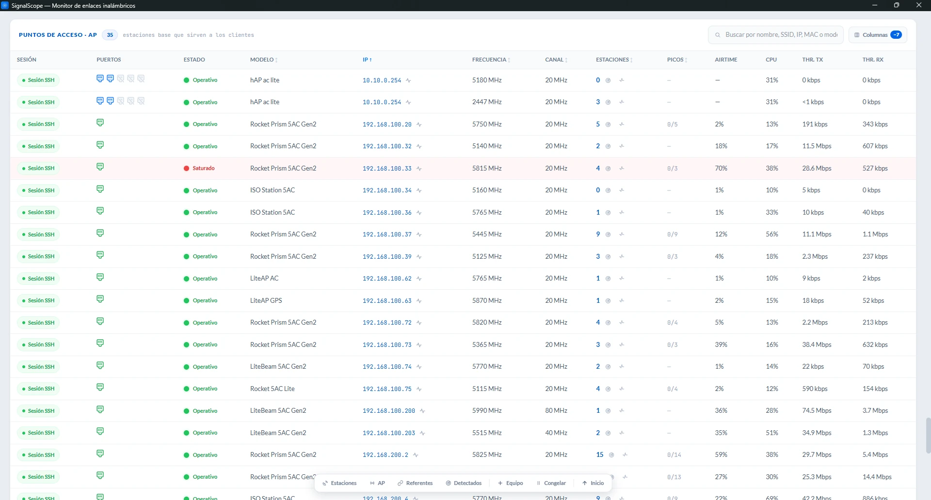
Status: the sector's verdict
The Status column is the AP's own diagnosis, combining four axes:
- Channel load: Operational (< 50 % air time in use), High load (50 to 69 %) or Saturated (≥ 70 %).
- Radio health: CPU and memory, at Warning or Critical.
- Sector latency: its stations' spikes (the Spikes column).
- The uplink port: an AP whose port negotiates half duplex moves to Warning, and one at 10 Mbps to Critical. See below.
The uplink cable condemns the whole AP
An access point whose port negotiates at 10 Mbps or in half duplex strangles all of its stations at once. The result is fifteen slow customers with pristine RF and no clue in the signal as to why.
That is why it tints its Status like any other device, and the sentinel warns with an event of its own, "LAN at 10 Mbps", which you can switch off in Preferences → Alerts.
An unplugged cable tints nobody, and that is deliberate, because it may be the customer's router switched off and not a fault of yours. The fact shows in the Ports column, and the sentinel reports the change.
Two details of the criteria:
- The sustained average is judged, not the instant. Opening an AP's web UI spikes its CPU for a few seconds, and that does not paint it red. The tooltip shows both numbers, as in "air in use 85 % (sustained 62 %)", so the verdict squares with what you see.
- Repeated short spikes are not saturation. That pattern has its own label, Unstable.
An AP with no reading shows — instead of a green, because without a measurement there is no verdict. The Status tooltip uses the same diagnosis format as the stations: the fact, its context and the causes.
The Stations cell: three gestures
Next to the number of connected clients (what the AP reports about itself) there are three distinct controls:
| Control | What it does |
|---|---|
| The number (link) | Filters the stations table to this AP's stations. It answers "who hangs off here?". |
| The radar | Asks the AP which stations it has and adds to Detected the ones the project didn't know. It does not depend on registered networks, so it finds antennas in segments the scan cannot reach, such as a new install. It works the same on airMAX and on MikroTik, and when it finishes it tells you how many are new, how many you already had, and which ones the AP sees at a different address. |
| The ping | Opens the continuous Ping with this AP's registered stations pre-selected. The tooltip says how many there are before you open it. |
The stations table has the reverse path: its AP column jumps to this row.
The other columns
| Column | What it shows |
|---|---|
| Session | The connection state, same as for stations. One click opens the session window, with its Actions, Ports, Log and Connection tabs, and from Actions you can switch the session off, mute its alerts or ask for a reconnection notice. If the AP goes absent, the chip says what is going on. |
| SSID | The network name the AP broadcasts. |
| Spikes | 3/14 tells how many of its online stations have latency spikes. It lights amber when the majority (and at least 3) have them: if one client has spikes, the problem is that client; if most of the sector has them, it is the shared air. With fewer than 3 stations online it shows —. |
| Airtime | The channel's air in use (%), the raw figure behind the Status. |
| CPU · Free RAM | The radio's health: CPU usage and available memory (for free RAM, more is better). It is uncolored. The verdict comes from the Status, which judges the sustained value, because opening the AP's web UI spikes its CPU for a few seconds and that is not a fault. |
| Thr. TX / RX | The AP's aggregate traffic, with all its stations together. Mind the direction: here TX is what goes down to the clients. It answers "busy with what?" when the air comes up high. |
| Ports | Every Ethernet port on the AP, with the same RJ45 connectors as in Stations. In the Ports tab of its session window you choose which ones the sentinel watches. The important case here is degradation: an AP negotiating 100 Mbps where it used to give 1000 looks perfect in RF and strangles its whole sector. The amber ↓ gives it away against its own history. |
| Frequency / Channel | Useful to spot overlaps between your own APs. |
| Name · Firmware · MAC · Model · TX Power · Uptime | Device identity and context. |
If an AP changes IP
The app looks for it through the IP its stations declare (airOS) or via ARP on this PC's network, reconnects on its own and leaves a notice in the bell: "<AP> changed its IP". For an AP that is not normal, so check whether its address should be fixed. While an AP is absent, its stations wait for it to come back.
As in every table, it has its own search box, sorting by header and hideable columns, and clicking the name isolates that AP (another click undoes it).
A MikroTik AP has no Airtime and no Spikes
RouterOS does not publish channel occupancy, and without link latency there are no Spikes either. Its Status is resolved with the axes it can measure (radio health and the uplink port), and those two cells stay empty. Details in Supported devices.
The diagnosis does not prescribe
When a sector shows spikes, the diagnosis delivers the fact and the triage (channel, load or weak links), but it does not prescribe "change the frequency". Three different causes produce the same picture, and the call is yours, with the context the app brings you.